Hammer Theatre Wayfinding System
Overview
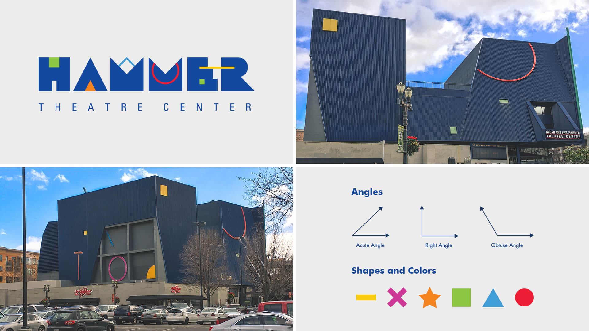
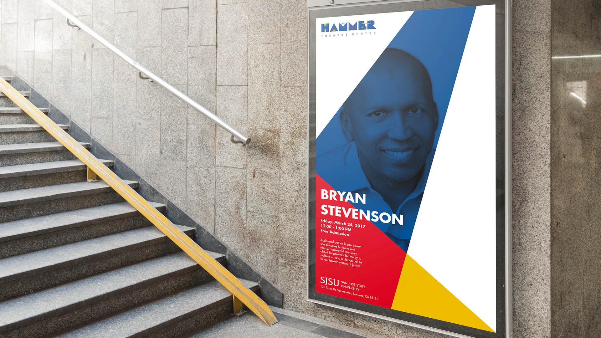
The project was to update the theater identity by creating an interior and exterior signage system. The designs had to emphasize the partnership between the Hammer Theatre as well as San José State University. Our solution was to create a mapping system that served as a guide to local landmarks while having the theater and university as its primary points of interest. The deliverables included posters, banners, brochures, and an exterior kiosk.
Role
Research, Kiosk Design, & Interior Signage
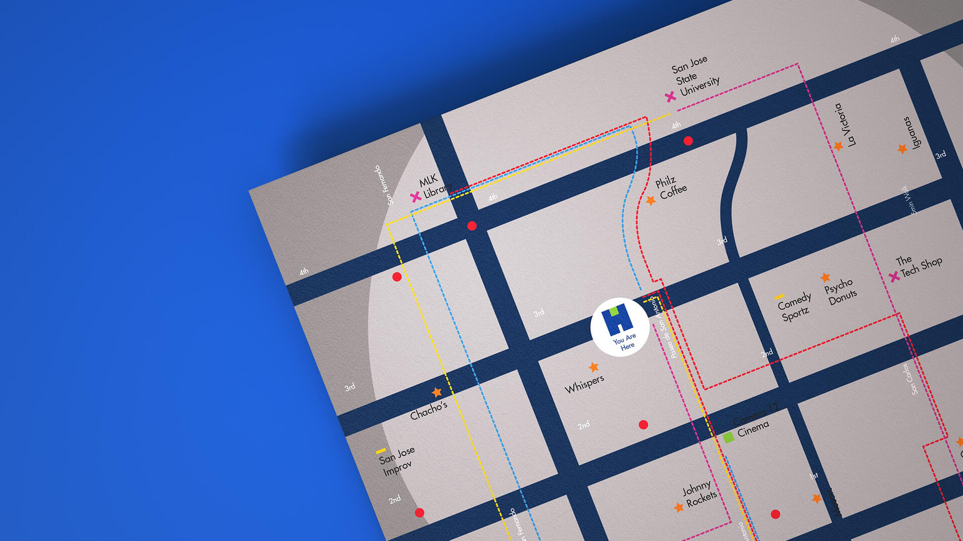
Kiosk and Map Design
One of the project objectives was to bring awareness to the Hammer Theatre as well as San José State University. To do this the map design included strategic routes that led to parts of the campus and the theatre. The kiosk design functioned as the primary directional system so the information was divided into two main sections. The first being heads up directions that pointed to the most important parts of town and the second being the map with routes travel times and points of interest.
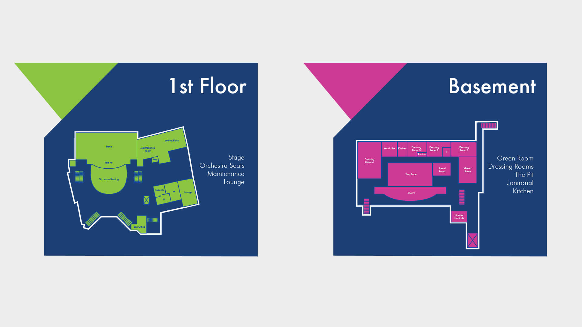
Interior Signage
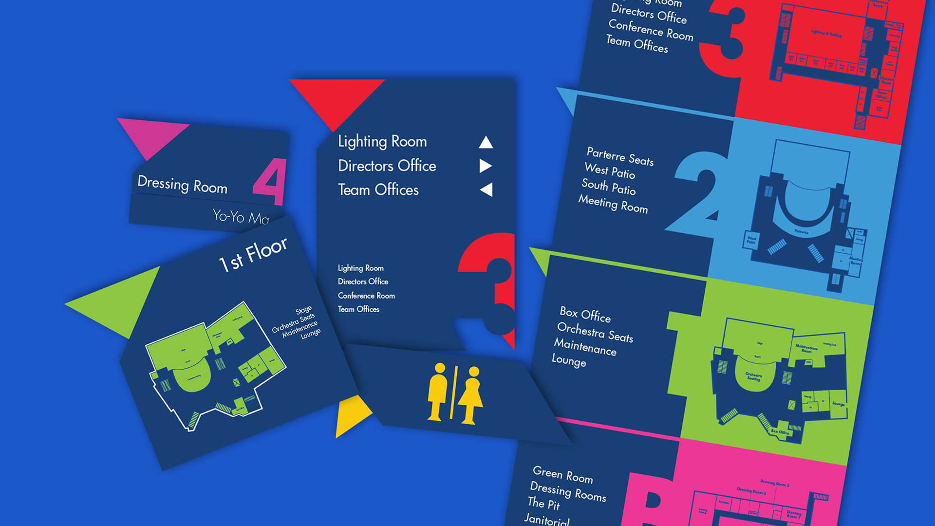
One of the main obstacles in updating the interior signage system was the difference in floor layouts. Each floor is unique but hard to read for anyone thats not familiar with the building. To address this problem the building maps were simplified to only highlight important areas for the actors/performers as well as the public. Each floor was labeled with a unique color to make it easier to identify while moving through the building. The colors are more prominent in the interior system because it is more closely related to the theatre and not the university.


Sam G. Vidal 2024 ©